
Kevin Del Toro is a graphic designer based in Los Angeles. With a focus in brand strategy, identity crafting, and visual storytelling. He aims to transform brand narratives into compelling experiences.
Kevin Del Toro is a graphic designer based in Los Angeles. With a focus in brand strategy, identity crafting, and visual storytelling. He aims to transform brand narratives into compelling experiences.
Selected Projects
(3)
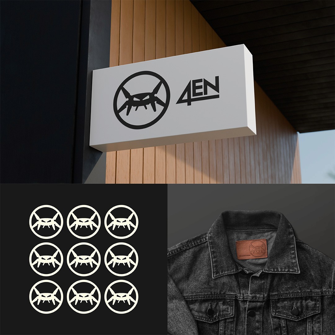
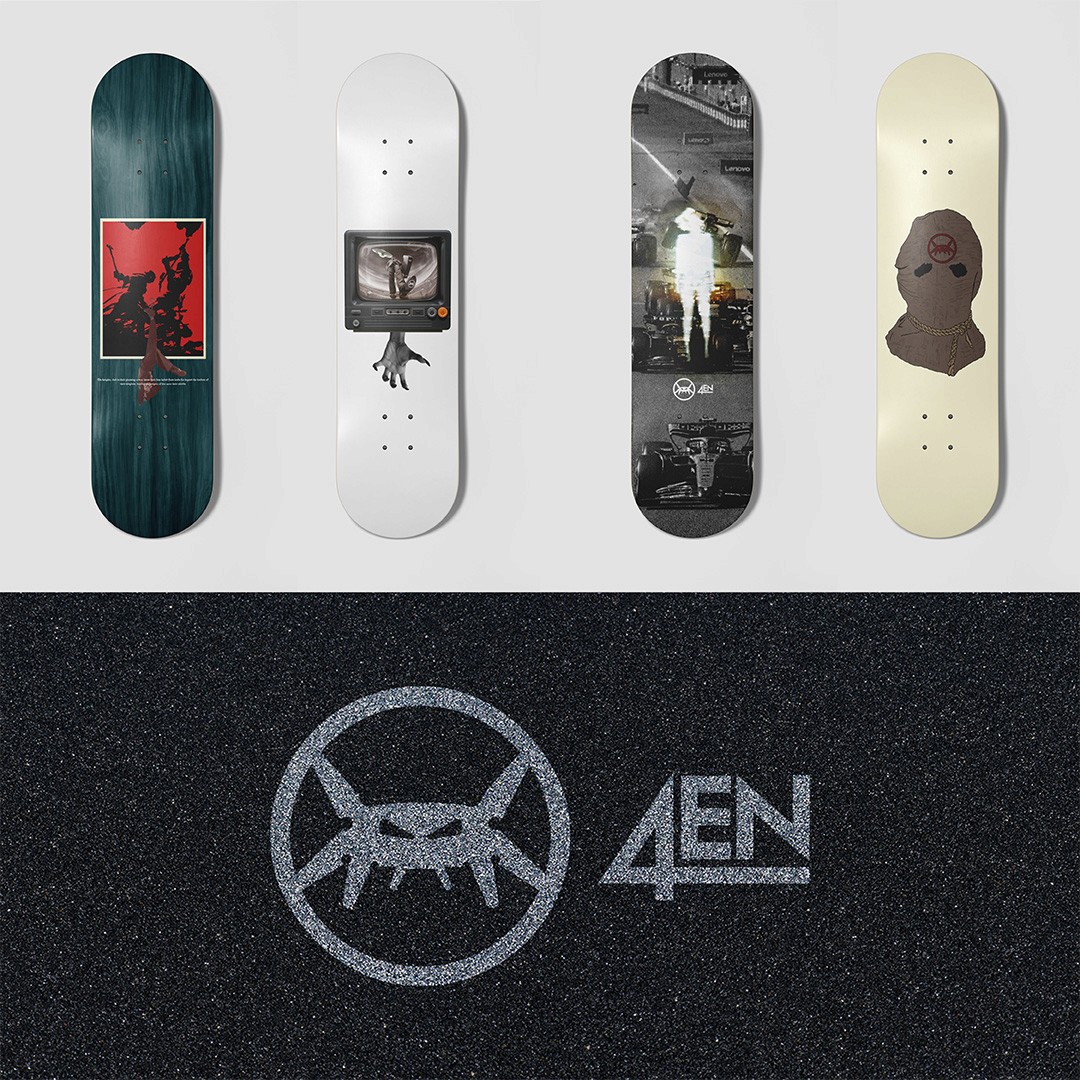
4en
Visual identity, logo design, social media graphics, typography.
Born in Los Angeles, 4en is a creative collective rooted in skate culture, fashion, and art. they celebrate the inclusive spirit of skateboarding. A culture that thrives on creativity, individuality, and community. Drawing inspiration from the streets of LA, they craft designs that blend the raw energy of skateboarding with contemporary fashion trends and artistic expression. their mission is to create art that resonates, inviting everyone to join them in showcasing the vibrant tapestry of their community to the world.
Granola Crunch
Rebrand, visual identity, packaging, typography, logo design, social media.
Granola Crunch is a conceptual rebranding project centered on transforming the look and feel of Cascadian Farm’s granola line. The original packaging was outdated and no longer resonated with the brand’s evolving audience. The goal was to develop a more playful and modern visual identity that would better connect with today’s consumers while still highlighting the product’s organic roots. The redesigned packaging features bold colors, cheerful illustrations, and approachable typography, creating a fresh and inviting shelf presence. The result is a dynamic new brand identity that captures the fun, wholesome spirit of Granola Crunch.


Up & Coming
Visual identity, typography, logo design.
Up & Coming, a convention designed to bring together emerging creatives from various disciplines. The event serves as a vibrant hub for networking, collaboration, and inspiration—offering artists, designers, and makers the chance to showcase and sell their work, connect with like-minded individuals, and discover new creative perspectives. The branding aimed to capture the energy and forward-thinking spirit of the convention through bold visuals, dynamic typography, and a fresh color palette. The result is a cohesive visual identity that reflects the innovative and community-driven nature of Up & Coming.


Kevin Del Toro designs for brands, creatives, and anyone looking to make a statement. Whether it’s crafting a brand identity, building out digital content, or developing visuals that elevate a story.